PRODUCT & INTERIOR DESIGN
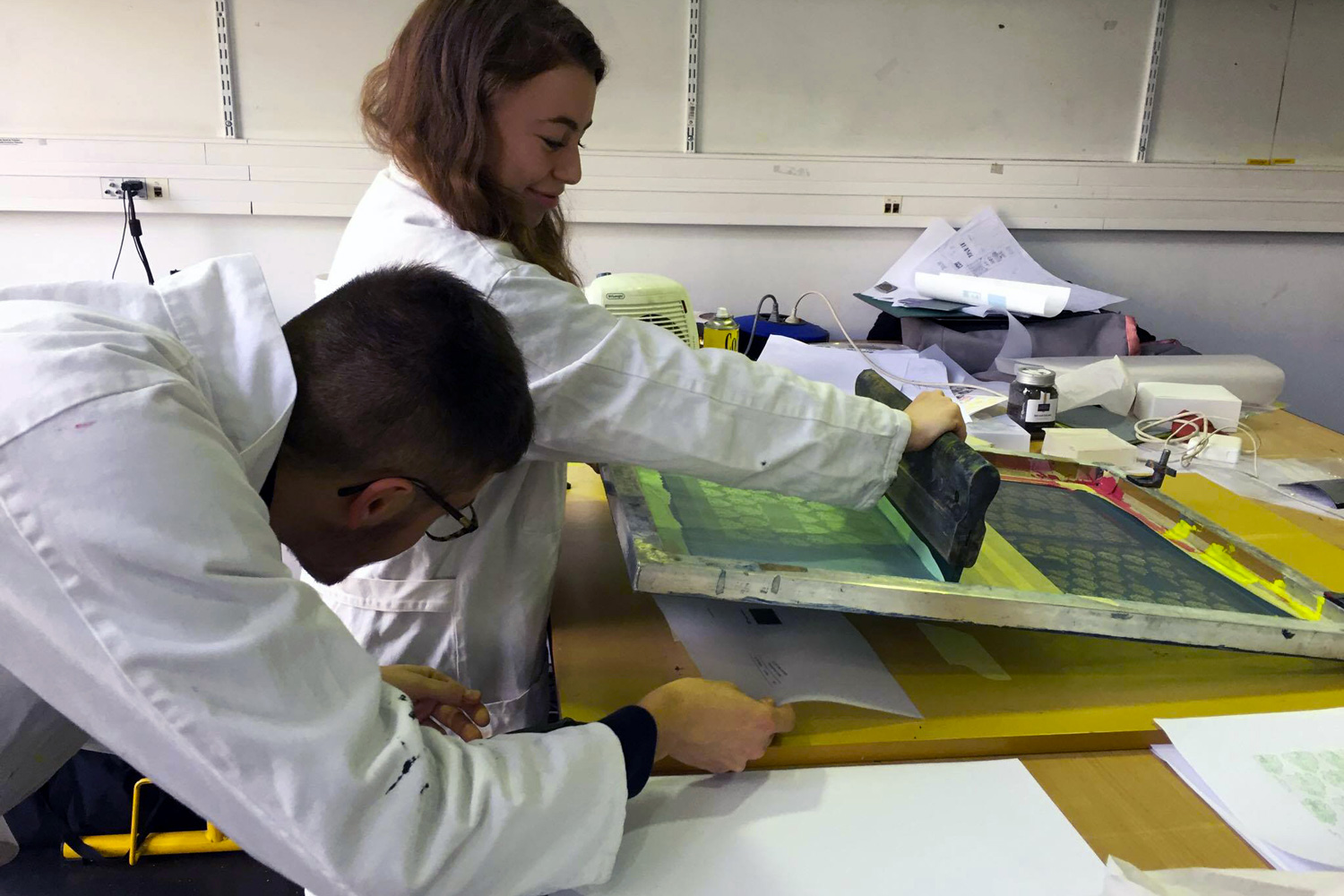
Workshop with Paul Vickers
Collab with :
Quentin Lambert,
Simon Leroux
et Yan Huang
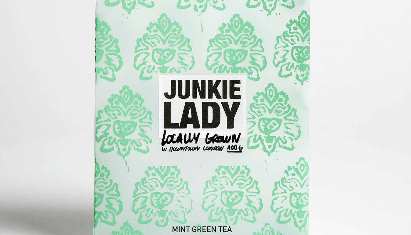
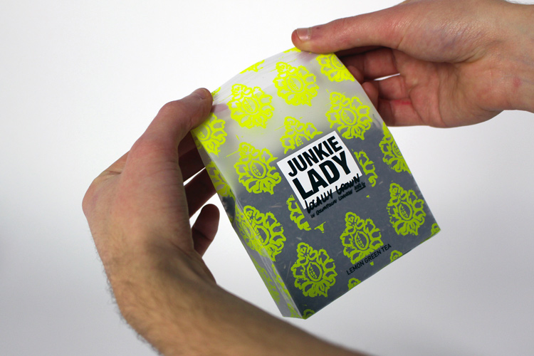
Junkie Lady
EN:
For this project, we had one week, working in groups of 4 to create a new brand of tea and work on its packaging.
For this project, we had one week, working in groups of 4 to create a new brand of tea and work on its packaging.
We called the tea « Junkie lady » as we wanted something both provocative and a reminder of the British tradition for drinking tea. We got inspired by the packaging of different packs of drugs, with different dirty patterns that made the « junkie lady » stand out. We wanted to apply this idea using visuals from old British ladies’ wallpapers, with a baroque look.
The final packaging is made with transparent paper on which those patterns were screen printed to have this colorful and unclean look we wanted at first.
Packaging
FR :
Par groupe de quatre, on nous a demandé de créer l’identité et le packaging d’une marque de thé. Le workshop était dirigé par le designer Paul Vickers (Pentagram, Design Solution, Interbrand).
Le thé est représenté par deux aspects : la grand-mère Anglaise qui boit son thé tous les jours à 16 h et le drogué qui boit du thé tout au long de la journée. Il y a une dualité entre ces deux univers, mais le thé permet de les rassembler.
Le résultat est un emballage semi-transparent qui contient des feuilles séchées, similaire aux sachets de drogue. Le sac est recouvert d’un motif proche du papier peint des grand-mères, imprimé avec de la texture comme les tampons, ce motif représente la saveur du thé. Le logo est minimaliste et montre les deux univers avec une typographie sans sérif et une manuelle, écrite avec un marqueur.